What we did
Nova Health, an emerging telemedicine startup, approached us to create a cohesive visual design system for their digital platforms. They wanted a patient-friendly, modern interface that reflected trust, care, and clarity—while differentiating themselves from sterile, overly corporate healthcare visuals.

Research & Discovery
Nova Health’s digital presence lacked visual coherence. The website and mobile app used mismatched colors, inconsistent iconography, and a generic stock look. Patients found it difficult to trust the interface, and the design didn’t reflect the brand’s warmth or professionalism. A unified design language was needed to bridge digital trust and accessibility.
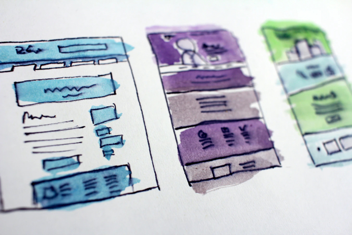
Analyzed competitor apps and healthcare websites to understand patient expectations. Interviewed potential users to identify pain points with readability, navigation, and emotional comfort. Built style mood boards exploring directions: minimal medical blue tones vs warm and approachable gradients.
Color System: Selected a calm palette of teal and sky blue with accent tones of orange for call-to-actions. Typography: Paired a humanist sans-serif for headings with a legible, open sans-serif for body text. Iconography: Created a custom icon set—simple line icons with rounded corners for approachability. Imagery Style: Defined a photo/illustration blend that uses real human faces paired with abstract medical graphics.
Impact
Improved Trust: Patients reported higher confidence engaging with Nova’s platform. Ease of Use: Navigation became intuitive; bounce rates on the website dropped. Brand Recognition: The consistent visual system differentiated Nova from generic healthcare platforms. Scalability: Templates streamlined creation of new marketing and educational materials.
E-book Alrifne
Branding